AloeVender
Website Redesign


CLIENT
AloeVender
DURATION
Nov 2022-
Jan 2023
MY ROLE
UX Design
UI Design
TOOLS
Figma
FigJam
Overview
AloeVender is a small business in Seattle. They sell aloe vera lotion and share skin care blogs on the website. As a UX designer, I analyze the current version of the website and redesign the whole website to help users complete their actions on the website without frustration.
Problem
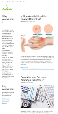
The current website places the blog on the main page with a list of unorganized product information, which confuses customers when they make purchases.
The part of the blog occupies the main portion of the current home page. Moreover, the left-hand side of the main page is full of product descriptions without categorization and highlighting, and the purchasing section on the left-button corner makes users pause and doubt whether they are in the right place to shop. The number of sales would decrease if the website does not give users intuitive and structural instructions to navigate for both shopping and reading blogs.
.png)
Solution
1.Reorganize the navigation bar
Rebuilding the information architecture by users' needs and expectations on navigating a skin care product website. Users can find the information instantly.
2.Make the Shopping action intuitively
Setting the buttons to enter the shopping page clearly and providing appropriate brand information of the product. Users can complete their purchases fluently.


3. Create a specific space for blogs with searching function
Moving blogs from the home page to the secondary page to support users' understanding of the products. Users can directly search for the keywords they are curious about.
Research
After identifying the problem, I consider that the following changes should be conducted on the website:
-
The blog should be replaced with another section in order to emphasize the main function of the website, a website for shopping and getting to know the brand.
-
The navigation bar should be improved to make users easy to identify the right place for their needs.
-
More detailed information about this brand should be presented on the website
To prove the assumption and understand the users’ insights in reality, I further conducted the research.
Qualitative Research
To figure out users' expectations, frustration, and needs, I conducted interviews with users who would like to buy skincare products in their daily lives.
The example questions I designed to ask in the interview include:
-
What do you care the most about skincare products?
-
What are the three factors that influence your decisions to buy skin products?
-
What kind of information do you expect to see when you enter a care-product website?
-
Look at the site together, what do you like about the website?
-
What do you think is the main failure of the website?
Key Findings from the Research
-
The features of the product, the contents of the product, and the customer reviews are the primary factors that influence users' decisions on buying a skincare product.
-
The clear presentation of information and the design showcasing the uniqueness of the brand are vital for users to stay on the website.
-
Users think the blogs related to the brand should not be put on the main page, or it became confusing to know the function of the website is to sell the product.
After analyzing the key findings, I came up with the ideation for redesigning the website in a more user-centered way. The changes include:
-
The purpose of the website as a product-selling website was emphasized by showcasing the features, functions, and reviews on the main page.
-
The color of the website was aligned with the logo of the brand to give users consistent recognition of the website.
-
The blogs were put under another header for a better position of information architecture and played an assistant role to help users understand the brand.
Ideation
I rebuilt the information architecture by creating a page for blogs and reorganizing the home page to meet users' main needs of "understanding the brand and "finishing the shopping process."
Information Architecture

Wireframing


Prototyping


Test
To ensure the website can be accessible to users who need visual aids, I conducted the usability test.
Main discovered issue:
"It is confusing to drag and browse the collection of product pictures on the shop page."
Before

After

Final
-
In the next step, more tests and iterations should be implemented in order to make users' experience seamless.
-
More user tests should be conducted for gathering in-depth feedback.
-
In the future, if the items of products increase, the information architecture will need to adjust.
-
During the whole redesign process, I consider it difficult to work alone in the role of UX designer, since the ideation can be restricted due to lack of feedback. However, I still got insights from the interaction with users, which was also helpful.
-
I learned that the communication ability between users and clients as a UX designer is rather essential. The ability to persuade clients to value users' opinions was also practiced.